Limp Bizkit, the nu-metal font
Limp Bizkit and Comic Sans MS share the same energy: reviled by purists, loved by everyone else. A logical match.
The backstory
Limp Bizkit, the nu-metal band fronted by Fred Durst, enjoyed colossal success in the late 90s and early 2000s. Three platinum albums, packed arenas, and a sulphurous reputation among music critics who never quite knew what to do with this blend of rap, metal, and provocative attitude.
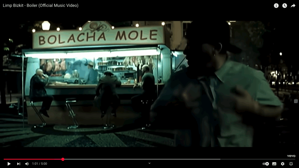
The connection to Comic Sans? It’s almost philosophical. Limp Bizkit, like Comic Sans, is a cultural phenomenon that the elite love to hate. Both are accused of lacking sophistication, taste, and subtlety. And both couldn’t care less, because the public has chosen. Comic Sans even makes an appearance in the “Boiler” music video, perfectly in line with the band’s raw, provocative aesthetic.
Why it’s a gem
Because Fred Durst actually used Comic Sans in official band communications. The gesture is perfect: provocative, unapologetic, and completely on-brand. When you sing “Break Stuff”, you don’t use Garamond.